
What I found interesting was that when I was checking out the Angular Material UI documentations under Component Table I found that they had some great table examples, but the table with filtering example does not make any match bold or highlight it in some way when you are filtering. For me that is the natural expectation of what would happen if you filter on something and get a match so you know what why the list item is being shown.
So this is something you have to add yourself, a quite easy task you’d think but it took me a few tries before I got the hang of it therefore I thought it would be worth noting here on FileIdea. I managed to get it work a few times but there was an issue with the capital letter or multiple matches, whenever there was a capital letter it would transform into a lowercase letter (since that is what was the matching letter) and another issue where if there was two capital letters and one being matched, it would keep capital letter on the first match but then transform any other character match and transform it into a capital letter even if it wasn’t. These small bugs are so annoying but satisfying when they are solved!
First let us try the example from the Angular Material UI website where it says table with filtering and copy paste the whole thing into your Angular project in some component. I have one prepared called testComponent which I created with the command:
ng g component test
So copy the code into your component like this in the .html file:
<div class="col-md-12">
    <mat-form-field>
        <mat-label>Filter</mat-label>
        <input matInput (keyup)="applyFilter($event)" placeholder="Ex. ium" #input>
    </mat-form-field>

    <table mat-table [dataSource]="dataSource" class="mat-elevation-z8">

        <!-- Position Column -->
        <ng-container matColumnDef="position">
            <th mat-header-cell *matHeaderCellDef> No. </th>
            <td mat-cell *matCellDef="let element"> {{element.position}} </td>
        </ng-container>

        <!-- Name Column -->
        <ng-container matColumnDef="name">
            <th mat-header-cell *matHeaderCellDef> Name </th>
            <td mat-cell *matCellDef="let element"> {{element.name}} </td>
        </ng-container>

        <!-- Weight Column -->
        <ng-container matColumnDef="weight">
            <th mat-header-cell *matHeaderCellDef> Weight </th>
            <td mat-cell *matCellDef="let element"> {{element.weight}} </td>
        </ng-container>

        <!-- Symbol Column -->
        <ng-container matColumnDef="symbol">
            <th mat-header-cell *matHeaderCellDef> Symbol </th>
            <td mat-cell *matCellDef="let element"> {{element.symbol}} </td>
        </ng-container>

        <tr mat-header-row *matHeaderRowDef="displayedColumns"></tr>
        <tr mat-row *matRowDef="let row; columns: displayedColumns;"></tr>

        <!-- Row shown when there is no matching data. -->
        <tr class="mat-row" *matNoDataRow>
            <td class="mat-cell" colspan="4">No data matching the filter "{{input.value}}"</td>
        </tr>
    </table>
</div>
Then proceed to copy the TypeScript code into your test.component.ts file:
import {Component} from '@angular/core';
import {MatTableDataSource} from '@angular/material/table';

export interface PeriodicElement {
  name: string;
  position: number;
  weight: number;
  symbol: string;
}

const ELEMENT_DATA: PeriodicElement[] = [
  {position: 1, name: 'Hydrogen', weight: 1.0079, symbol: 'H'},
  {position: 2, name: 'Helium', weight: 4.0026, symbol: 'He'},
  {position: 3, name: 'Lithium', weight: 6.941, symbol: 'Li'},
  {position: 4, name: 'Beryllium', weight: 9.0122, symbol: 'Be'},
  {position: 5, name: 'Boron', weight: 10.811, symbol: 'B'},
  {position: 6, name: 'Carbon', weight: 12.0107, symbol: 'C'},
  {position: 7, name: 'Nitrogen', weight: 14.0067, symbol: 'N'},
  {position: 8, name: 'Oxygen', weight: 15.9994, symbol: 'O'},
  {position: 9, name: 'Fluorine', weight: 18.9984, symbol: 'F'},
  {position: 10, name: 'Neon', weight: 20.1797, symbol: 'Ne'},
];

/**
 * @title Table with filtering
 */

 @Component({
  selector: 'app-test',
  templateUrl: './test.component.html',
  styleUrls: ['./test.component.css']
})
export class TestComponent {
  displayedColumns: string[] = ['position', 'name', 'weight', 'symbol'];
  dataSource = new MatTableDataSource(ELEMENT_DATA);

  applyFilter(event: Event) {
    const filterValue = (event.target as HTMLInputElement).value;
    this.dataSource.filter = filterValue.trim().toLowerCase();
  }
}
Also add the CSS so it is 100% width:
/* Structure */
table {
    width: 100% !important;
    margin-bottom:500px;
}

.mat-form-field {
    font-size: 14px;
    width: 100%;
}
Now let us see how it looks!
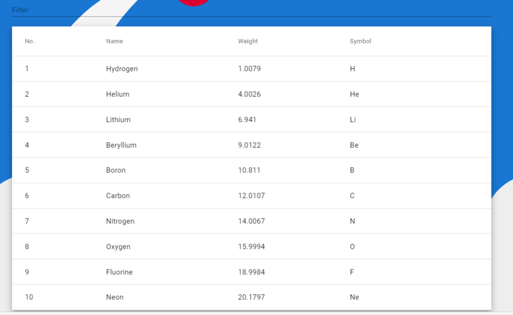
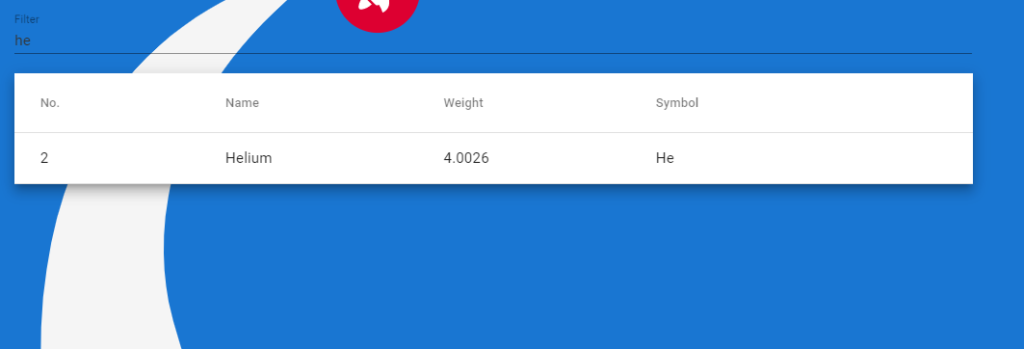
Fair enough! Kind of annoying that the text is black and the background is blue but let’s focus on what is important. Try write something into the filter field and see what happens. I’ll write he and I see only the result that contains he in any field.
Here is where we want to step in and make it bold. What we need to accomplish this is to create a custom pipe that will receive the original string and a value and transform it. What we will transform into is the original string but with <b></b> around the value we send in.
Create a folder called pipes. Then in it, create a file called bold.pipe.ts. In it add the code:
import { Pipe, PipeTransform } from '@angular/core';
import { DomSanitizer } from '@angular/platform-browser';

@Pipe({
    name: 'bold'
})

export class MakeBold implements PipeTransform {
    constructor(private sanitizer: DomSanitizer) { }
    transform(value: any, args: any): any {
        if (!value)
            return value;
        {
            value = value.toString()
        }
        if (!args) {
            return value;
        }

        // Match in a case insensitive maneer
        const re = new RegExp(args, 'gi');
        const match = value.match(re);

        // If there's no match, just return the original value.
        if (!match) {
            return value;
        }

        const replacedValue = value.replace(re, "<b>$&</b>")
        return this.sanitizer.bypassSecurityTrustHtml(replacedValue)
    }
}
Note that we will do a toString() if we have a value coming in the the pipe, reason is because this function will crash when it tries to handle the number values and if it not is a string, then the match function does not exist.
Also in your app.module.ts add MakeBold under declarations.
Since we are now working with HTML, we must tell the component to display HTML instead of the plain variable values. So instead of the previous {{element.position}} and so forth, remove it and use innerHTML with the variable instead like this:
<div class="col-md-12">
    <mat-form-field>
        <mat-label>Filter</mat-label>
        <input matInput (keyup)="applyFilter($event)" placeholder="Ex. ium" #input>
    </mat-form-field>

    <table mat-table [dataSource]="dataSource" class="mat-elevation-z8">

        <!-- Position Column -->
        <ng-container matColumnDef="position">
            <th mat-header-cell *matHeaderCellDef> No. </th>
            <td mat-cell *matCellDef="let element" [innerHTML]="element.position  | bold: dataSource.filter"></td>
        </ng-container>

        <!-- Name Column -->
        <ng-container matColumnDef="name">
            <th mat-header-cell *matHeaderCellDef> Name </th>
            <td mat-cell *matCellDef="let element" [innerHTML]="element.name  | bold: dataSource.filter"></td>
        </ng-container>

        <!-- Weight Column -->
        <ng-container matColumnDef="weight">
            <th mat-header-cell *matHeaderCellDef> Weight </th>
            <td mat-cell *matCellDef="let element" [innerHTML]="element.weight  | bold: dataSource.filter"></td>
        </ng-container>

        <!-- Symbol Column -->
        <ng-container matColumnDef="symbol">
            <th mat-header-cell *matHeaderCellDef> Symbol </th>
            <td mat-cell *matCellDef="let element" [innerHTML]="element.symbol  | bold: dataSource.filter"></td>
        </ng-container>

        <tr mat-header-row *matHeaderRowDef="displayedColumns"></tr>
        <tr mat-row *matRowDef="let row; columns: displayedColumns;"></tr>

        <!-- Row shown when there is no matching data. -->
        <tr class="mat-row" *matNoDataRow>
            <td class="mat-cell" colspan="4">No data matching the filter "{{input.value}}"</td>
        </tr>
    </table>
</div>
Now let’s try it out again and search for he.
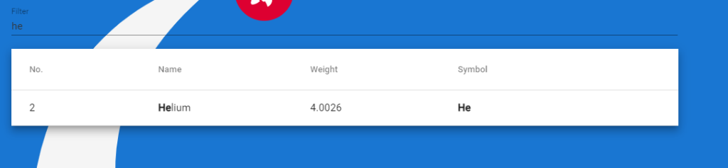
And now it works as we want! This is the best method I found so far because now it will highlight any letter we put in even if it is a lowercase letter we write it will match it on the capital H. It will always preserve the lowercase or uppercase when we search. Pretty good!
Latest Comments